

As well as flexibility on the source of camera image streams, DCM has multiple options for display of that data. The default dashboard displays data in zones, which are defined on a map of the customers building or site. There can be one or many cameras per zone – but by default the Density, Flow, Mood and Headcount data displayed in the graph is from a single camera.
DCM can optionally however, be set up to combine data from multiple cameras into a single graph as a total or average. This can be a particularly powerful option for live capacity counting. For example, if the customer has a large room that is covered by several cameras, this data can be combined into a single simple page view that graphs “Total Headcount” in the room in real time. Custom formulas can even be applied to compensate for areas of a busy area not covered by camera views to estimate the missing headcount and give a total current attendance.
You can then add an alarm to instantly notify key staff if a set capacity of the whole area is breached.
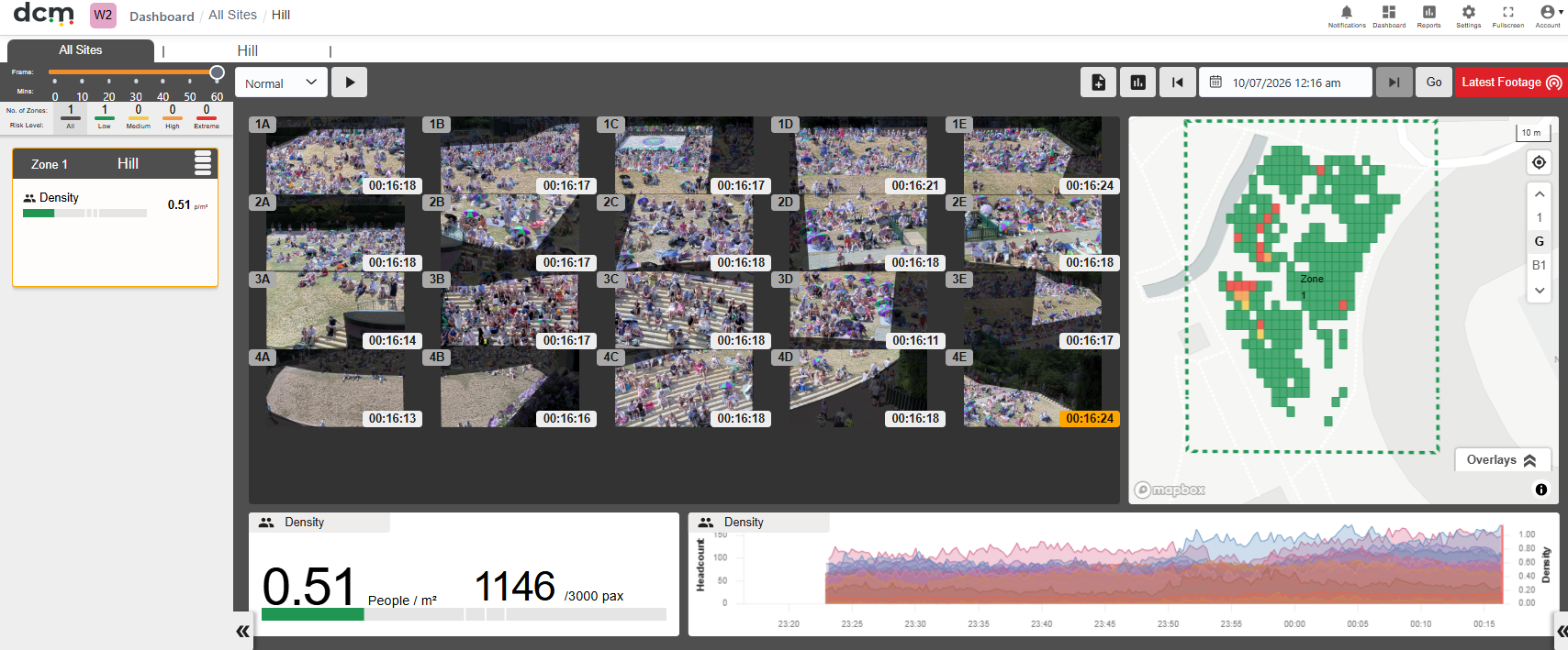
Similarly data for Density, Mood and flow can be combined in a Composite Dashboard to supply the average density, flow speed or mood in a large area by combining data from multiple cameras into a single zone dashboard.
The Dashboard, is in fact designed to be highly configurable and modular. The DCM team can design a custom Dashboard for your unique requirements, to display the data important to you in the simplest and clearest format, and hide other data that is not relevant.
For more detail on this option, see the section in this manual on “Composite Dashboards”.