Welcome to Dynamic Crowd Measurement!
DCM is a next-generation tool for understanding crowd dynamics and emergent behaviour to help event managers and venue owners make better decisions.
This is a quick guide to the essentials of logging in and using the dashboard.
You can access DCM at the following URLs depending on your geographic location.
Asia Pacific:
https://dcm.crowdeagle.com.au/
Europe:
https://eu-west-3.dcm.crowdeagle.com.au/
North America:
https://us-west-2.dcm.crowdeagle.com.au/
You will see a login screen:
Use the credentials that will have been sent to you by the DCM team to log in:
Which should take you to the top level DCM map screen.
Each camera or group of cameras, covers what we call a 'zone'. Each will have a “Zone Card”, down the left side.
It will look something like this.
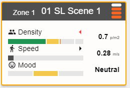
If you click on one of these cards - it will open up the main dashboard.
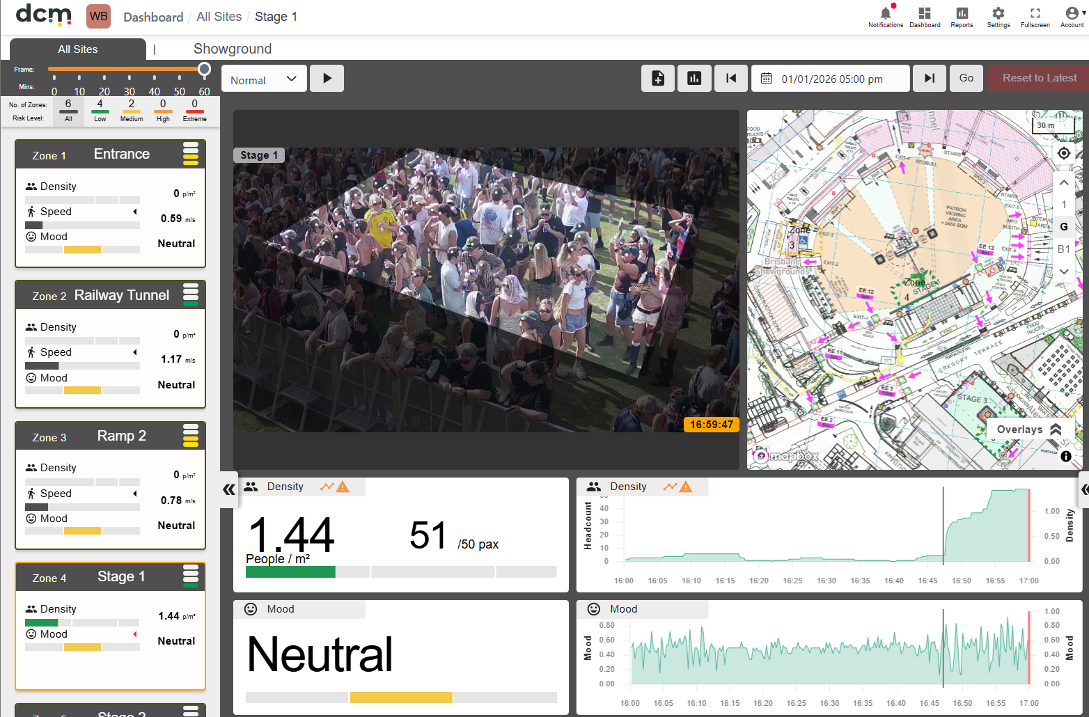
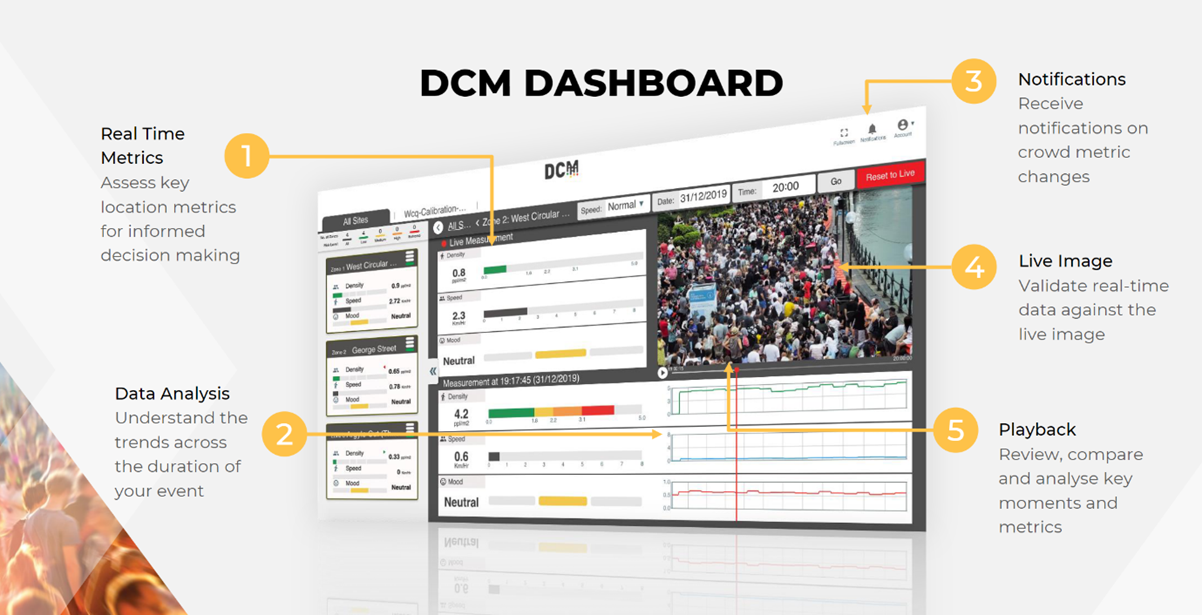
Each zone has a sample image from the camera - and 2-4 graphs.
The graphs show
-
Average Density and Headcount in the sample area (the light central area), as people per meter squared
-
Average mood on a scale from '1 = Extremely negative" to 0 = Extremely positive
(negative is higher as its intended to be a graph of 'risk')
-
Average Flow speed for all people in the view in meters per second.
The system can also perform "Across the line" counting - this feature can be enabled to count users entering gateways.
If enabled, the current in and out counts will show up as a fourth graph.
By default the system will take you to the current time.
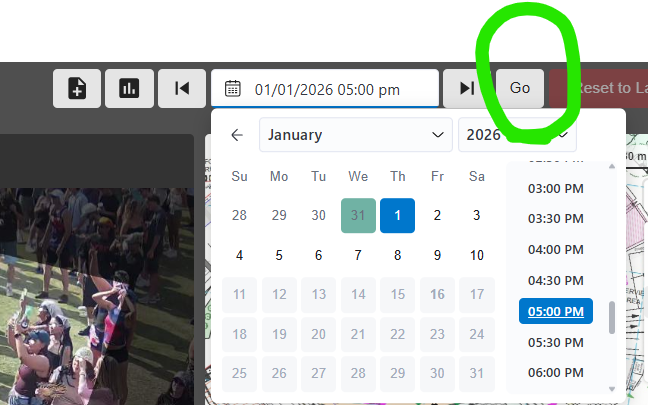
To view historical data, you need to use the date picker at the top right to look at historical data. Dates with data are shaded. Pick a day, a time and then press the 'go" button to move to that hour of data.
The dashboard shows sample images every 15 seconds or so - just to give some context to the graph numbers.
Data sample times may not exactly match the time of the screenshot.
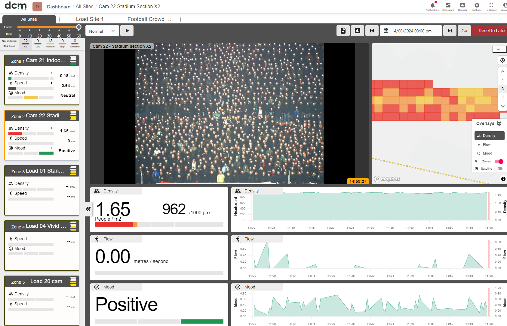
The panel to the right is for alarms - you can set alarms for headcount, density flow or mood on any cam, although currently no alarms are set.
To give you an idea of potential uses,
We could alarm on headcount in a queue, density in a high demand viewing area, or even live audience sentiment reactions - like the example below.
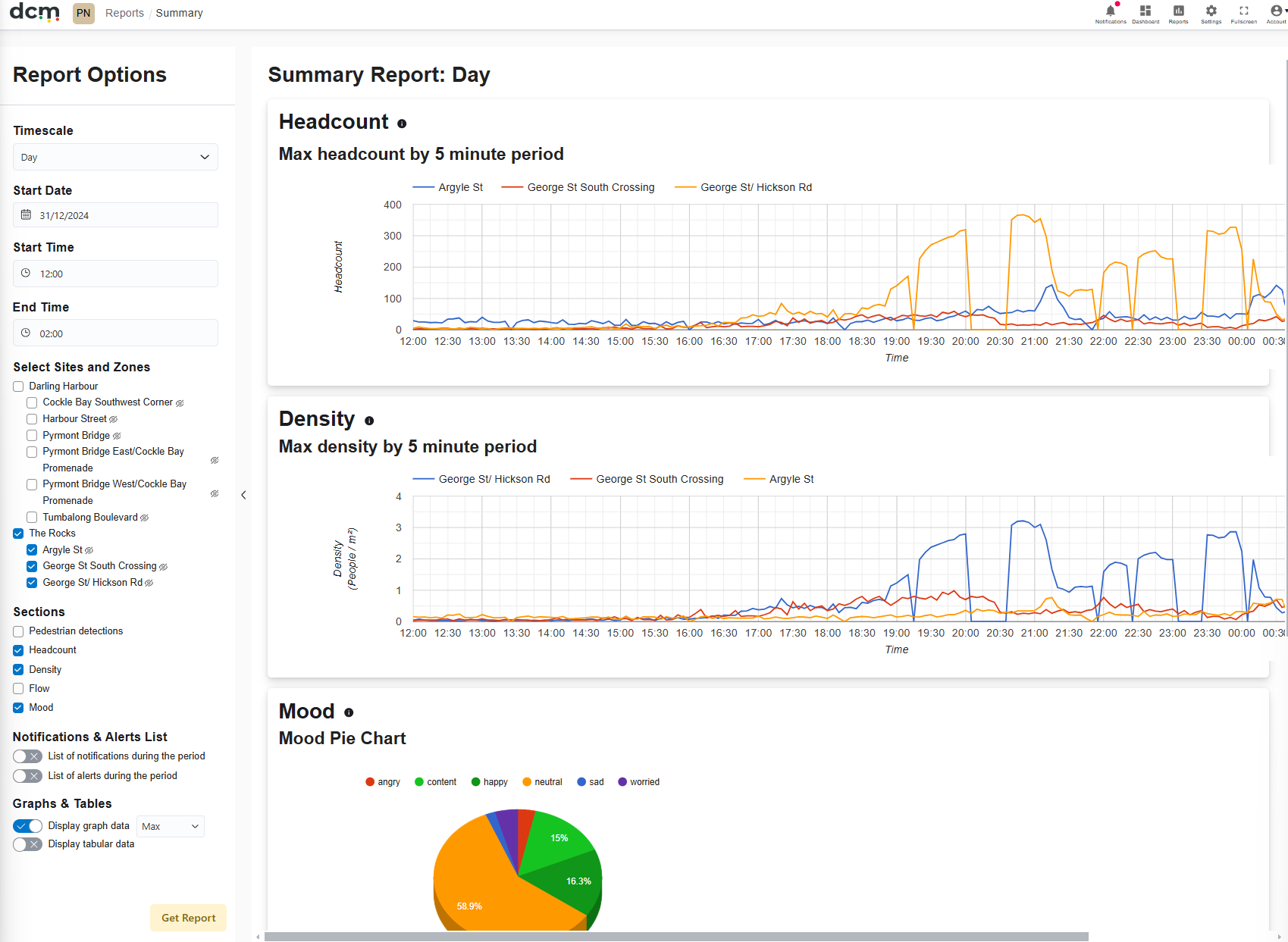
It has a full reports feature too, accessible using the 'reports' icon in the menu at the top right.
Then select the "Summary" report
Then using the panel on the left - select a time interval and date.
You need to also select at least one camera, and at least one graph type (density and mood will be most interesting).
Once you are happy with your selections - press the "Get Report" button to generate a summary table for the selected time period.
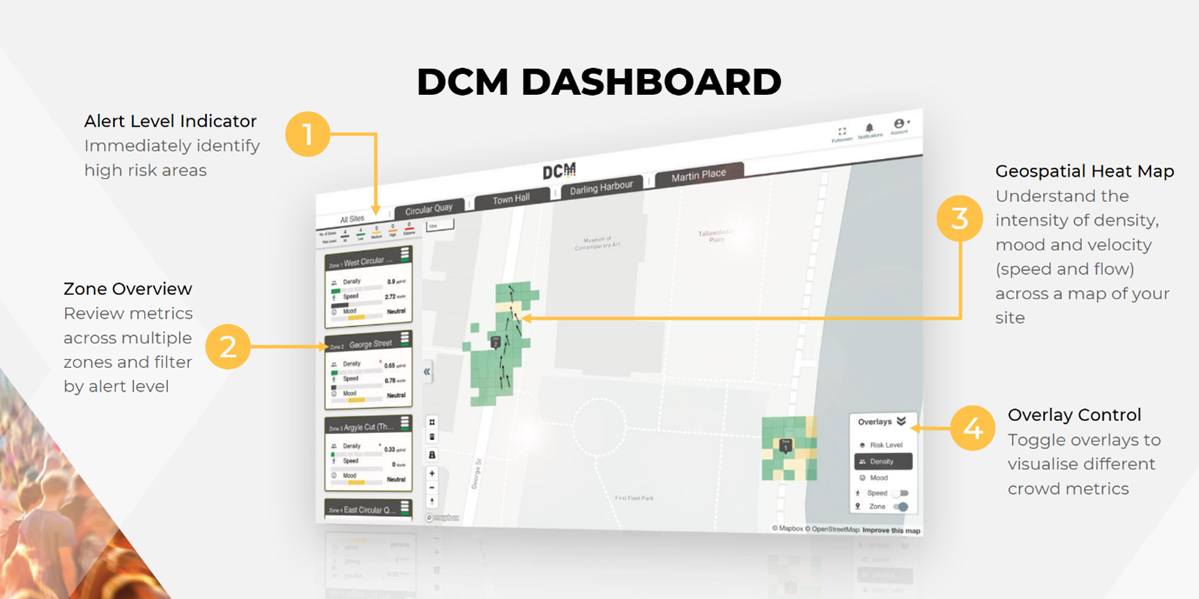
The below slides give a quick overview of the Dashboard.
For more detail, consult the full manual.