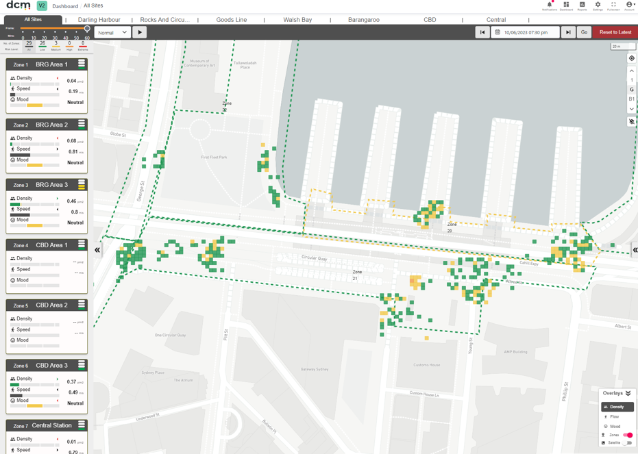
The DCM default dashboard can be used as both a real time overview of an event in progress, highlighting areas of interest or concern, or a post event review tool using the built in playback tools.
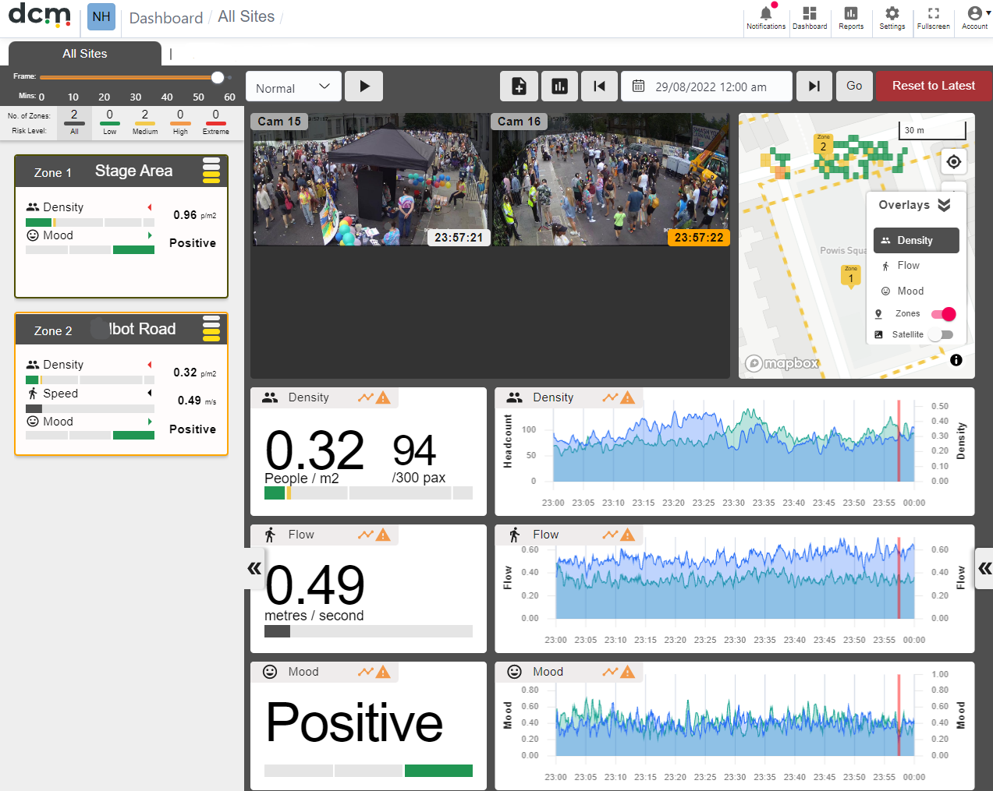
It integrates a map view of one or more major sites, and camera zones within that site, as well as video samples from your cameras, and detailed statistics. The initial map view includes heatmap overlays for Density, Flow and Mood, that can quickly highlight areas of interest. Defined zones are shown as dashed lines, with the colour indicating current risk levels.
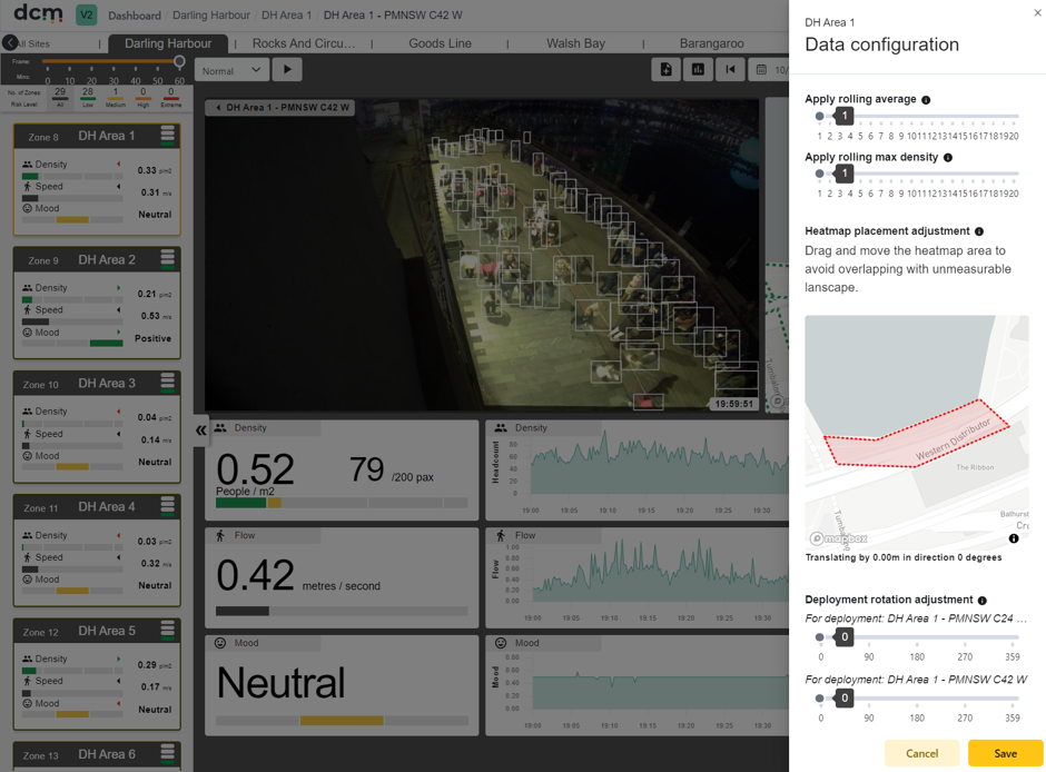
After you click on one of the zone cards in the left hand panel, it will open up the detailed data for that zone. A zone may have one or more cameras.
The DCM dashboard runs on most common browsers. Chrome is recommended, Firefox and Microsoft Edge have also been tested. It does not support old versions of Microsoft Internet Explorer.
Your map view contains the following areas:
Zone cards: The list of zones within the site for quick and easy monitoring.
Sites: The top navigation bar that allows you to quickly move from site to site using tabs.
Map: The map shows the zones and a real time heatmap of all detections within the zone.
Video footage: The samples from the video feed can be taken at a configurable interval, and allow the user to assess what was happening, and match events up with the statistical analysis. Playback speed can also be adjusted. Live feed update frequency varies with settings and location, up to a current maximum sample rate of one frame every fifteen seconds.
Historic data graphs: The dashboard provides historic data in one hour blocks, visualised as line graphs for each zone. If alarms have been configured for the current zone, times when the alarm thresholds were breached are highlighted in red. There are also options for data smoothing, and customizing the view.
The Menu at the top right, contains additional useful links.
System settings can be accessed using the gear icon. These settings will be discussed in detail in the next section.
The other options are as follows.

Notifications Button – Click on this to see an audit trail of changes to the project. The red dot indicates unseen new entries.

Reports button – Click on this to access the reporting engine

Dashboard – Click this to return to the the main dashboard from another page
At zone level (after clicking on a zone card) there are some more options available.

Notes – click this to add a custom note, at the currently selected time point. This can be useful for post event reviews. These notes can be retrieved in the reports screen, or via the API.

Zone configuration – this opens up a ‘Data configuration’ panel where zone specific risk levels and settings can be configured.